1918's Influenza Epidemic, Here – Part 1, The View from Nine Mile Cemetery


Text
[CHART 1 HERE]
November, 1918 was the worst month, according to Nine Mile Cemetery’s mute but somber testimony.
The first eight months of the year, from January to August, saw an average of five new graves per month at Nine Mile. Then, September saw eight deaths. One, notably, was that of a soldier killed in action over in France; another was caused by lobar pneumonia, one of the typical diagnoses assigned to deaths occasioned by influenza. The latter was possibly the first of the influenza epidemic’s victims at Nine Mile.
October saw a rush of new graves, thus also offering the first tangible evidence that the epidemic had now reached our area — there were 19 total deaths, 13 from influenza. Ten of these 13 influenza deaths fell in that month’s final 11 days. And then came November, with its 40 total deaths – eight times the graveyard’s typical monthly average – 37 from influenza. As in October, November’s deaths were concentrated in one portion of the month – 33 of its 37 influenza deaths occurred between the 1st and the 14th. Hence, the 25 days from October 20th to November 14th yielded the influenza epidemic’s greatest concentration of deaths, according to Nine Mile Cemetery’s record.
Total deaths in December, which included four from influenza, fell back to nine. Then January, 1919’s toll bounced back upward, with 14 total deaths, 10 from influenza. February became the first month since August, 1918, with no influenza deaths at all among its eight new graves. March saw seven total deaths, two from influenza. And then, finally, influenza all but disappeared in the remaining months of 1919, with perhaps a single additional death in May, 1919. In April and the remaining months of 1919, total deaths returned to the pre-epidemic average of five per month.
As registered in Nine Mile Cemetery’s experience, influenza had taken some 68 lives over the epidemic’s full run. The disease’s demographics were unusual — and are still largely unexplained. Instead of the usual pattern for flu – that is, disproportionately striking the very young and the very old (in what epidemiologist sometimes refer to as a “U-shaped” distribution) — the 1918-1919’s epidemic struck young adults the hardest.
The average age of Nine Mile’s 68 deaths was 35. As in the rest of the nation, the middle years provided the epidemic’s main targets. Twenty-six of Nine Mile’s victims, or 38 percent of the total, were in their thirties; 52, or 76 percent, fell in the broader age range from 20 to 49 years old. (Epidemiologist sometimes characterize the 1918-1919 influenza’s age distribution as “W-shaped.”) Among other sad implications, so great a concentration of victims in their 20s, 30s, and 40s would deprive many young families of a cherished and much needed parent.
The ratio of male to female deaths was also unusual. Here, but not necessarily also in the nation, male deaths greatly outnumbered female deaths. Fifty-three males (78 percent) and only 15 females (22 percent) perished from influenza at Nine Mile. The average age of female deaths, it may be noted, was a little younger than male deaths – 29-years-old for females; 37, for males. Nationally, the epidemic’s mortality may have moderately favored male deaths over female, but only moderately. “Whether males or females were more seriously affected by the epidemic,” said a contemporary epidemiological analyst, “is still an open question.”
Why were there so many more male influenza deaths at Nine Mile? One explanation is simply that, owing to our area’s mining industry, the population of vulnerable males between 20 and 49 was considerably larger than that of females. U.S. Census estimates for July 1, 1917, however, show that the male-to-female ratio in Shoshone County’s population was nearly 1:1.
Another inviting hypothesis is that mining tended to congregate males together in ways that females were not subject to – in, for instance, mine hoists, bunk houses or dormitories, and mess halls. According to Idaho historian Leonard J. Arrington, Idaho’s State Board of Health, following a recommendation from the U.S. Surgeon General, “…issued a statewide order, effective October 10, 1918, prohibiting all public assemblies ‘as a precaution.’” Churches, schools, dance halls, and other places of public assembly were closed. (The contemporary Wallace Press Times newspaper reported that citizens particularly missed going to Wallace’s several movie theaters while the ban remained in effect.) Men working in mining may have in effect partially sidestepped the public health benefits of these measures. But other factors, including the possibility of differential burial at Nine Mile Cemetery, may also have played roles in Nine Mile’s strongly skewed sex ratio.
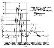
Arguably the most intriguing epidemiological aspect of Nine Mile Cemetery’s record of the epidemic concerns its course over time. The distinguished American epidemiologist, Wade Hampton Frost, published an article on the then-recently concluded epidemic in August of 1919.* His article included a graph showing the patterning of mortality from all caused from July, 1918 to April, 1919 in three large American cities — Boston, Washington, D.C., and San Francisco. As is clear from context, Frost saw the trendlines in his chart as chiefly reflecting the impact of influenza-related deaths in each city.
Frost’s graph (which he labeled “Chart 4”) illustrated three quite similar patterns in the epidemic’s course over time in these three locations. In all three, it had begun with a relatively sudden sharp upward spike, followed next by an almost equally great fall and dip, followed in turn by a somewhat lesser increase (which Frost termed the “recrudescence”) and fall.
The initial sharp spikes in these three cities were lagged across the three cities – with Boston’s coming first, D.C.’s second, and San Francisco’s, third. Frost analysis also suggested that the epidemic’s temporal patterning in U.S. cities could vary considerably (illustrated in his article’s next chart). Yet, the broad similarities evidenced in the three trendlines offered in Frost’s Chart 4 remain evocatively suggestive of a common temporal process.
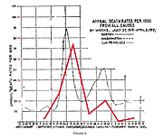
In the following graph (below), we have taken the liberty of gently erasing Frost’s trendlines for Boston and D.C., and adding, mutatis mutandis, a trendline for the month-to-month mortality figures for influenza deaths at Nine Mile Cemetery (solid red line). Once again, the two trendlines evidence a notable similarity. But what might it mean that a big, cosmopolitan city like San Francisco and a small and isolated locale like the catchment area for Nine Mile Cemetery reported such similar temporal trends?
Frost read the various sorts of data his article offered as suggesting that “…the infection was already widely disseminated in this country some time before a serious epidemic was recognized.”
At a minimum, our chart also suggests that something essential about the disease’s epidemiological character was driving similar temporal patterning. In the end, Nine Mile Cemetery’s graves seem to be telling us, in effect, that even our community’s small numbers and isolated geography afforded no real protection against the 1918 influenza epidemic’s forceful dynamic process.